Showing posts with label 2D. Show all posts
Showing posts with label 2D. Show all posts
Thursday, 20 February 2014
Stop The Privatisation Of Student Loans
So that's that, two intense weeks and this is the outcome... I think for just two weeks its pretty good to be fair. Eline Lindaas animated the swinging shackle shot for me and Vicky Keaveney animated the girl's hair, legs and arms in a cycle during the falling scene once she has been eaten by the suited guy, so serious thanks to them for helping me out in my hour of need.
Due to the time constraints I had to just get the animation to a standard where it was passable, having to then leave it and move onto the next bit. I am aware there's a lot wrong with it and it is limited animation, but I think its strong style carries it through and makes it interesting to watch. Ideally I would have created this by hand instead of on Toonboom, where I could have given the characters a lovely boiling texture by scribbling with black pen when I coloured them in, but unfortunately that never would have been finished in time. I really do long for the day when I have enough time to create something exactly the way I want it, but I feel this is growing to be a rare commodity in animation these days.
Saturday, 25 January 2014
'A Dog's Afterlife' Animation Shot
This is my animation test shot for my pre production module, with the background Vicky created. I animated it in Toonboom so I had issues with the technical side, I ran out of time as I was trying to loop the run cycle and make it look like the dog was getting closer to camera just before my hand in time, so I just had to make do as I couldn't get Toonboom to co-operate. I had wanted the camera to follow the dog as he ran in a close up and then to remain still as the dog runs up to the camera, blotting out the screen with his nose. I couldn't work out how to do this in time though.
The run cycle was hard to do, as it was a quadruped running at a three quarter angle, so I looked at some reference of dogs running and went from there. I animated it on runs, doing the body, then the head etc. I actually preferred the run before clean up, when it was just scribbly lines, as it seemed to flow more and have much more power. I made the outline of the dog far too thick, which may have contributed to the loss of fluidity. I hope to upload the work in progress at some point and to just have a looping cycle of the dog.
Ernie and Maggie were easy enough to animate, I've got some fairly nice things going on there, with a good overlap on the finger pointing action. I'm pleased with the run but just wish I had had more time so I could have been pleased with the end result, but I do want to go back to this and improve it.
'Chasing Birds' Colour Storyboard
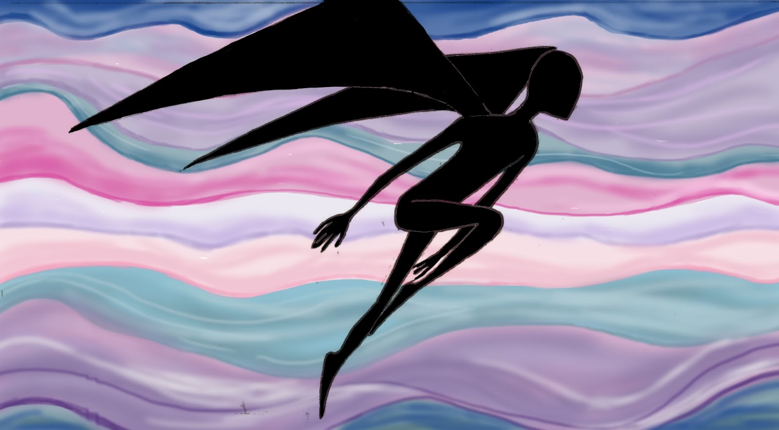
Eline drew out a beautiful storyboard for me to colour. I coloured it digitally on Photoshop, taking my colour palette from the Vogue covers. I tried to incorporate the Vogue style by using busy patterns on the wall, curtains and table, while keeping it fairly clean elsewhere, with minimal tonal changes. I used a lot of pink in the indoor scene as I wanted to make it look like somewhere Eliza would hate, so I played off the whole pretty-pink-delicate-fancy-flowery type thing. I also made Eliza slightly bolder in colour than the room as I wanted her to look like she didn't fit in and her environment of Victorian England was weak and pallid in comparison to her.
The sky during the dream sequence was meant to look a bit trippy and surreal and when the winged silhouette of Eliza starts to disintegrate into birds the sky is quite a violent red firey colour, almost as though her dreams of flying are burning up.


Friday, 24 January 2014
11 Seconds of Destruction
So that was my finished line test of the 11 Second Club project. If I had had more time I would have coloured it and sorted out the overlapping of characters and blocks issue, hopefully I'll find some time to do this even though I've already submitted this for marking. I'm quite pleased with this, I think my run works well as it shows off the hyperactive childish personality of the kid. I think the first kick could have been more powerful if I'd have held the foot in the anticipation pose for longer and then had a faster kicking action, as at the minute it is quite slow as I had to drag out the timing to fit it with the sound effects. I also mucked up the stretch and squash of the first jump kick but i realized what I did wrong and corrected it for the later jumps (I didn't keep the boys volume the same during the stretch and I didn't squash him at the climax of his jump). I also think I could have pushed the kid's performance even more by making him more chaotic in his movements. Even though I didn't use stretch and squash on the face, I still think the emotions are easily read by just his facial features moving about. I would've liked to have put more secondary animation on him, such as his hair bouncing up and down but unfortunately I didn't have time.
I tried to keep the bully quite rigid in his movements as I wanted him to seem intimidating, like he didn't need to put any effort into pushing over the kid, as only his arms really move. I tried to make his walk look stompy but it could have done with a bit more work and his footsteps should have been shorter to create more of a stomp effect.
I had issues with drawing the characters separately as the bully ended up overlapping the kid when he advances on him, so I had to rejig my timings which created a lot of extra work for me as it effected how the blocks had to fall in order to match up with the sound effects. So next time I need to plan more thoroughly how the characters work with each other.
The blocks were the last thing I animated and were quite difficult as there were so many of them and I needed them to fall in specific places, so I mapped out trajectory paths for all of them to help plan where they would move. I didn't put any stretch or squash on them so they don't have much believable weight to them, the only reason they have any is because of my spacings of them.
11 Second Club Work In Progress
Here is my animation in progress, I've got the basic body of the annoying kid completed and the key poses of the bully.
11 Second Club Key Poses
Below is my LAV test for the 11 Second Club project. I used this to help me plan out my key poses, which I drew rough thumbnails of before drawing them out on my animation paper.


When I actually drew up the key poses, I tried to push them more than I have in these thumbnails, to get more of a performance out of the characters. This next video shows my key poses put to the sound clip. I animated the characters and blocks on 3 separate sets of paper, which is why all the lines overlap as I just overlaid the 3 sheets needed for each frame on top of each other in premiere pro. I drew out the characters roughly to start with, using just the basic shapes to get the animation right before adding details.
Sunday, 10 November 2013
Final Funny In 15 Film
So here is the final version of our Funny In 15, I animated the character with the newspaper and Zoe animated the masturbating guy. It was pretty easy to animate and I was able to loop some parts too.
Saturday, 17 August 2013
Dog Walk Cycle
Wow I haven't made a post in aaaaages! So to make up for it here's a fairly long one :)


I'm really happy with this as I think you can see the weight moving through the body and I've got a nice squash effect going on when the paws hit the ground.
I've just finished a walk cycle which is loosely based on my dog. So first of all I videoed my dog walking for reference:
I then tried to figure out the key poses and other useful things using my video as a guide as well as consulting Richard William's quadruped walk cycle. My findings are shown in the image of my sketchbook as I'm too lazy to type them out...

I sketched my dog for a bit as I wanted my design to be based on her and then I took a look at a dog's skeleton to give a better idea of how the bones are all connected. And as you can see from my diagram they have an extra joint in their legs compared to humans.

I then took a look at some dog designs that were roughly the same build as the dog I wanted to create (basically a more athletic looking version of my dog) to use as inspiration. I was also looking at how the dog's forms have been simplified, for example how a few tufts of fur are drawn rather than covering them in it, which still suggests to us that they are furry.


I mocked up a quick keyframes only cycle on Flash to make sure I'd got the basics of the walk down. The secondary action for the ears was easy enough to judge time wise but the tail took a few attempts to get right, as it follows the movement of the hindlegs but is just a little delayed.
I then set out drawing my final walk cycle. The fur on the stomach took a couple of attempts as I exaggerated it too much and it looked pretty weird, so I had to tone it down. Here's the pencil version before I cleaned it all up, I'm showing you it because in some ways I prefer it to my final version, as I think it has more of a flowing quality and looks looser, with the fur having a good swish motion going on.
So after all that here's my final version:
I'm really happy with this as I think you can see the weight moving through the body and I've got a nice squash effect going on when the paws hit the ground.
Friday, 31 May 2013
Blood...............
I enjoyed making this scene...
Again, I don't like the vectors, but it is sufficiently gory to make up for this. If I'd have painted this out in watercolours frame by frame or something similar I'm sure it would've looked better, however time was not on my side, so corners had to be cut.
Colision!!!!
I'm not too happy with how vectorized my character looks, but that's the trouble with animating in Flash. I was pleased I managed to turn him round though.
Underwater Scene
Look at all the shiny bubbles :)
This is the background I animated for our underwater scene, as well as the bubble to eye morph. I wanted to animate the sea rolling around violently and the bubbles spiralling around Elise but I didn't have enough time. It's nowhere near violent enough, but it'll do.
Monday, 27 May 2013
More Walks
For motion studies we were given a choice of walks to create, I chose bad mood and late for work.....
I'm not particularly happy with either of these, the characters are basic and a bit ugly and I didn't have time to put any secondary animation, like hair, on them. But I think you can tell which one's which at least.
Finished 2D Adaption
Here are some sketches of what my robot would look like and how to animate the water dripping:

Here's the finished thing:
I think the camera move works well and the background looks good, with it having a slight 3D aspect thanks to Toonboom. The drip works alright, but you don't actually notice it as your eye is not drawn to it, it's tiny and it's not on screen for long. Therefore it was a bit of a waste of time and was evidently a mistake in my original planning. The animation on the robot is pretty poor and was honestly a bit rushed because of encroaching deadlines. Toonboom seems like a really great piece of software and I want to get to grips with it, as it's obviously much better for animation than Flash, but much less user friendly. This project however has been a nice little introduction to it.
Falmouth Animation Ident
I'm really happy with how this turned out! I think it's quite entertaining and it doesn't get annoying watching it multiple times, which is important in an ident. I had quite a few issues when exporting from Flash but it worked out fine eventually after much frustration and high pitched whining on my part. I would've liked the chewing to have lasted longer before the electric shock happens, but we had a 10 second limit so I couldn't. I think the seagull maybe should've blinked one more time, when it bites down the first time. But these are minor complaints.
Wednesday, 8 May 2013
Adaption Project Update
This is just a quick post to say I changed the colourings of my background for the adaption project. I did have it like this:

But now I've changed it to this:

I think this looks a lot better as it's a lot more atmospheric and less garish. See, I have a problem where I go over the top with things, and this was the case when I was tweaking the colours in Photoshop originally. I asked around and the general consensus was that the toned down image looked better. At least I know I'm doing it now and so I just need to stop tampering with my work so much.
Sunday, 28 April 2013
Sea Sick
I've been working on how the sea will animate during the memory part of our Sea Project film. I wanted it to look really violent and scary so I used sharp forms to create the waves. I made this test shot by painting the 10 different wave shapes with ink and then using Flash to actually stick it all together and tween it. I wanted to get quite a lot of motion in to make the sea look rough, which is why I chose to have the waves actually rolling rather than just moving in a fixed position from side to side. I think I've achieved what I was after :)
This is the same as above but I used Olivia's scribbles on top of my waves and i cleaned up the edges of the waves as they were fairly messy.
I thought the scribbles made the sea look less intense as the addition of white caused them to look a bit weak and washed out, so I went back into Photoshop and played about until I got the colours shown in the video below. I think this version works the best as the sea looks the most frightening here. If you stare at these waves for long enough without blinking, it does actually make you feel kinda sick, as well as screwing with your eyes, so I'll take that as a success in itself!
Friday, 26 April 2013
First Test Shot!! Woop Woop!!
This is my first test shot for the sea project. I animated it in Flash (I'm getting to grips with the pen tablet, finally!) and I'm pretty damn proud because it turned out way better than I thought it would. I mean it's still in a very rough state but I think this has potential and I loved doing it, so really want to take it further. Once the background gets all painted up I think the vector character and the painterly background will work really well together too. I'm not looking forward to doing the lip sync though, since I really suck at that.....
Saturday, 13 April 2013
A Random Walk
This is a rather random walk I made. I made the legs kick fairly high behind and then raise up high before the contact position, as well as making the arms swing out away from the body. It was an experiment... It's too weird to be used again I think but it was still worth trying. The legs make the person look like they're taking huge steps.
Wednesday, 10 April 2013
Walk Cycle Attempt 2
Here's another walk cycle. A slightly different angle and hey look I coloured it in! I didn't clean it up much so it's pretty messy. I was trying to really thrust the shoulders back and forth with this one and I think it makes the guy look a bit angry/sulky/aggressive/ something along those lines.
Subscribe to:
Posts (Atom)