Thursday, 20 February 2014

Happy Clouds. Scary Clouds.

These are the two backgrounds for the first shot, created by hand and then touched up in Photoshop. I decided to use Toonboom for the animation as it would be the quickest way, so I placed the clouds on different layers so I could animate them moving.


Protest Animatic


Here's the animatic for the protest against the privatisation of student loans animation. The black part was meant to have a scene showing a suited man sucking money out of the world through a straw until it shrivels up, but this was later cut from the animation. I had to record myself doing the voice over to get an idea of the timings, as the committee had not recorded one yet. The script was later changed so I had to swap things about later and some parts were cut, also when I received the actual voice over I was supposed to use, it was at a different pace to how I had spoken it so this caused more rearranging. It was quite good working for people who had no idea about the process of animation and how incredibly long it takes, as it will prepare me for future jobs.

Protest Animation

Recently I was asked to create an animation by the Falmouth Protest Committee that would inform people about the privatisation of student loans. They gave me a script which I had to follow and a deadline of two weeks. These two weeks were fairly intense to say the least, but it was a cool project to work on and I'm glad I did it, even if it did mean going without sleep for a fair few days. Hopefully it will help with the protest against the selling off of student loans in some way.

They wanted a simple, black and white look to the animation so I set about designing the characters, going for stick people type designs. I needed a boy and girl that people could relate to, as these would be the students having their loans sold off. I felt a dark, slightly Tim Burton style would work well as it would emphasize the negative consequences of the selling off of the loans, however I also drew up some less gothic characters as I wanted to give the committee options. They agreed with me though and so I went ahead with the slightly gothic style. 


I also needed two suited, corporate looking characters. I tried to give them a threatening, monsterish look, leaving them faceless to show their lack of emotions as they do not care about what happens to the students. I kept everything very sharp and angular, emphasizing that they are the bad guys in the situation.


Saturday, 25 January 2014

'A Dog's Afterlife' Animation Shot

This is my animation test shot for my pre production module, with the background Vicky created. I animated it in Toonboom so I had issues with the technical side, I ran out of time as I was trying to loop the run cycle and make it look like the dog was getting closer to camera just before my hand in time, so I just had to make do as I couldn't get Toonboom to co-operate. I had wanted the camera to follow the dog as he ran in a close up and then to remain still as the dog runs up to the camera, blotting out the screen with his nose. I couldn't work out how to do this in time though. 
The run cycle was hard to do, as it was a quadruped running at a three quarter angle, so I looked at some reference of dogs running and went from there. I animated it on runs, doing the body, then the head etc. I actually preferred the run before clean up, when it was just scribbly lines, as it seemed to flow more and have much more power. I made the outline of the dog far too thick, which may have contributed to the loss of fluidity. I hope to upload the work in progress at some point and to just have a looping cycle of the dog.
Ernie and Maggie were easy enough to animate, I've got some fairly nice things going on there, with a good overlap on the finger pointing action. I'm pleased with the run but just wish I had had more time so I could have been pleased with the end result, but I do want to go back to this and improve it.


'Chasing Birds' Colour Storyboard

Eline drew out a beautiful storyboard for me to colour. I coloured it digitally on Photoshop, taking my colour palette from the Vogue covers. I tried to incorporate the Vogue style by using busy patterns on the wall, curtains and table, while keeping it fairly clean elsewhere, with minimal tonal changes. I used a lot of pink in the indoor scene as I wanted to make it look like somewhere Eliza would hate, so I played off the whole pretty-pink-delicate-fancy-flowery type thing. I also made Eliza slightly bolder in colour than the room as I wanted her to look like she didn't fit in and her environment of Victorian England was weak and pallid in comparison to her.

The sky during the dream sequence was meant to look a bit trippy and surreal and when the winged silhouette of Eliza starts to disintegrate into birds the sky is quite a violent red firey colour, almost as though her dreams of flying are burning up. 


Friday, 24 January 2014

11 Seconds of Destruction


So that was my finished line test of the 11 Second Club project. If I had had more time I would have coloured it and sorted out the overlapping of characters and blocks issue, hopefully I'll find some time to do this even though I've already submitted this for marking. I'm quite pleased with this, I think my run works well as it shows off the hyperactive childish personality of the kid. I think the first kick could have been more powerful if I'd have held the foot in the anticipation pose for longer and then had a faster kicking action, as at the minute it is quite slow as I had to drag out the timing to fit it with the sound effects. I also mucked up the stretch and squash of the first jump kick but i realized what I did wrong and corrected it for the later jumps (I didn't keep the boys volume the same during the stretch and I didn't squash him at the climax of his jump). I also think I could have pushed the kid's performance even more by making him more chaotic in his movements. Even though I didn't use stretch and squash on the face, I still think the emotions are easily read by just his facial features moving about. I would've liked to have put more secondary animation on him, such as his hair bouncing up and down but unfortunately I didn't have time.

I tried to keep the bully quite rigid in his movements as I wanted him to seem intimidating, like he didn't need to put any effort into pushing over the kid, as only his arms really move. I tried to make his walk look stompy but it could have done with a bit more work and his footsteps should have been shorter to create more of a stomp effect.

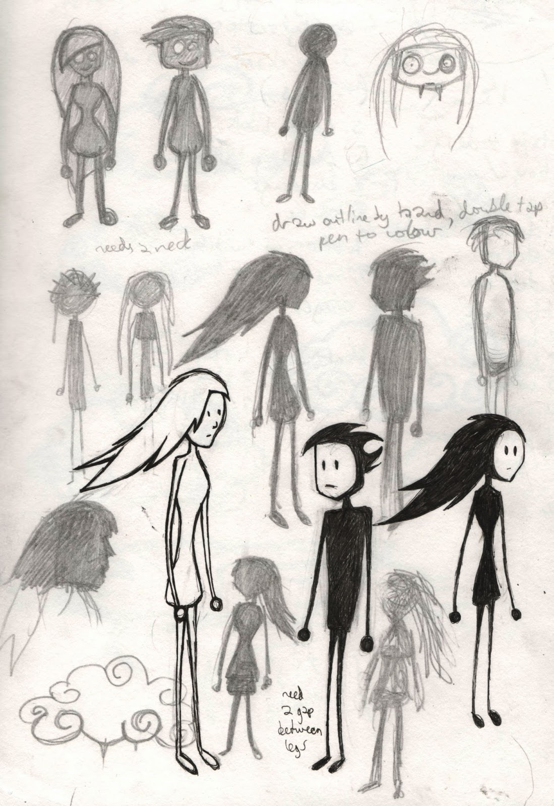
I had issues with drawing the characters separately as the bully ended up overlapping the kid when he advances on him, so I had to rejig my timings which created a lot of extra work for me as it effected how the blocks had to fall in order to match up with the sound effects. So next time I need to plan more thoroughly how the characters work with each other.

The blocks were the last thing I animated and were quite difficult as there were so many of them and I needed them to fall in specific places, so I mapped out trajectory paths for all of them to help plan where they would move. I didn't put any stretch or squash on them so they don't have much believable weight to them, the only reason they have any is because of my spacings of them.

11 Second Club Work In Progress


Here is my animation in progress, I've got the basic body of the annoying kid completed and the key poses of the bully.

11 Second Club Key Poses

Below is my LAV test for the 11 Second Club project. I used this to help me plan out my key poses, which I drew rough thumbnails of before drawing them out on my animation paper.


When I actually drew up the key poses, I tried to push them more than I have in these thumbnails, to get more of a performance out of the characters. This next video shows my key poses put to the sound clip. I animated the characters and blocks on 3 separate sets of paper, which is why all the lines overlap as I just overlaid the 3 sheets needed for each frame on top of each other in premiere pro. I drew out the characters roughly to start with, using just the basic shapes to get the animation right before adding details.


Sunday, 5 January 2014

Tough Kid Character Designs

The character development for the second character in my 11 Second Club animation, the tough bully type kid.


Hyperactive Kid Character Designs

Continuing with the 11 Second Club project: here's my character development for the main kid in my animation. I was trying to make him look cheeky and mischievous, I believe I have succeeded....


In the above image I had a play with adding more detail to the head and making it a slightly more complex shape, however I don't think the character retains its charm when its simplicity is removed. And it makes animating easier!