I made a poster for the film as I recently had to compile all the work I have done so far onto a disk as part of my hand in for the first semester of my third year. I used the poster as the CD cover (I cropped it to CD size of course) and for the front cover of my production bible.
Friday, 23 January 2015
Many A Rock
Thursday, 22 January 2015
Background Concepts
Here are some background concepts. I think the second one works really well as the colours are quite strong and slightly ominous, fitting with the mood of the scene.
Tree Designs
I drew some visual reference of Arctic trees and then tried to put an Inuit spin on them.
I put together this concept of Aluki in a more realistic landscape, I think it looks alright but it doesn't sit quite right somehow. It may be because she is quite stylized, so would look better in a more stylized world.
Birch trees: the one on the right is a more realistic version, but has the simplified form of an Inuit sculpture. The others are more abstract and have an Inuit pattern on them rather than the usual birch tree markings.
This is an idea for trees shown in the far background, which will be cut outs rather than 3D models. So this could be painted on something like cardboard.
I put together this concept of Aluki in a more realistic landscape, I think it looks alright but it doesn't sit quite right somehow. It may be because she is quite stylized, so would look better in a more stylized world.
Sugary Salty Snow
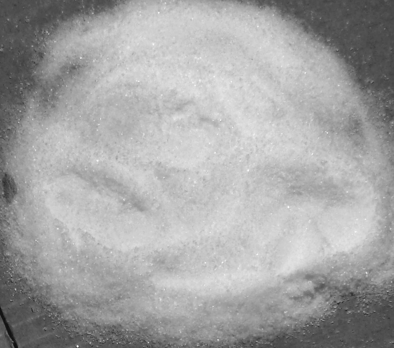
I made some tests for snow, using salt and sugar.
Sugar
Salt
Sugar and Salt Mix
Ground Sugar and Salt Mix
The ground salt and sugar test, which I ground up in a blender, looks the most like snow. It has the same thick, powdery texture as snow. And footprints hold quite well in it. The snow concoction goes hard after a couple of days, but that shouldn't be an issue for my film..
The Building Of Igloos
Here we have some material tests to see what the igloo should be made out of. These were created by Martin Burn. I think the sanded plastic one (front left of the group photo) has the best texture and looks pretty interesting with the light shining through it
Martin also made a mock igloo, to check that it is the right size for the puppets. We decided it needed to be a little bigger to allow room for me to get my hands in comfortably, allowing me to be able to move the puppets about when animating.
Polar Bear Character Development
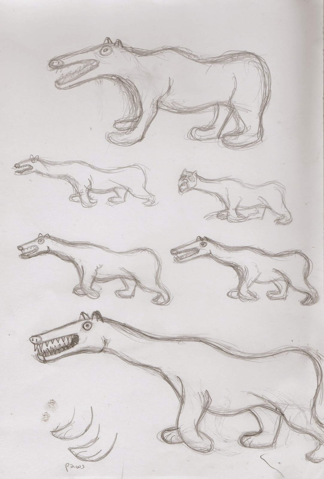
Here is my development work for the polar bear. I made it quite abstract to start with, using the Inuit art as inspiration, but then decided it didn't look enough like a polar bear, so I had a redesign. It needs further work, I want it to have a slightly chiselled, carved sculpture look to it, if possible.
Bird Design Development
Here are some bird designs for the ones that stare at Aluki and transform into the Creature. So they need to be very starey. I'm basing them on the Inuit owl carving shown below.
I tried carving a bird out of balsa wood, but it was very hard to even get this crude shape, so I do not think balsa is a suitable material to make the puppets out of. It does have a cool texture though. Shame.
Creature Puppet: The Second Skinning
With my new knowledge of silicone I tackled the Creature puppet once more. I think he looks quite good, it's not exactly as I want but it will work. But the problem is that he is not animatable. The silicone, with its rubbery properties, will not allow for enough movement, springing back into place rather than staying put, as the silicone is stronger than the armature. My tutor says I need ball and socket joints and a rod in his back... but I'm not sure if I'll be able to get hold of these. If I make the silicone layer incredibly thin and water it down with white spirits, as well as making the Creature himself skinnier, it might make the whole thing more flexible... I need to do some tests....
Creature Armature Adjustment
I took my disastrous puppet to my stop motion tutor and she informed me that yes, I had most definitely used far too much oil paint in the silicone, but also that I had put too much polymorph on the head, making it too heavy for the armature, as it caused tremors to run through it, so if photographed it would be difficult to make it still. So as shown below I cut all the oily silicone mess off the puppet, as well as the foam, which the oil paint had seeped through and then melted off a large amount of the polymorph joining the face to the neck, making the head lighter.
Silicone and Oil Paint Skin Tests
I found this fantastic video that showed me how to use silicone properly:
Here are some tests I did of silicone on foam. I realised that white silicone is horrible stuff and clear works so much better. It has a nicer texture, finish and can achieve more subtle colours. I was able to get the mottled effect I was after and score cracks in the silicone with a cocktail stick. I learnt the silicone needs to be realy thinly applied in order to work, allowing you to build it up in layers.
Subscribe to:
Comments (Atom)


