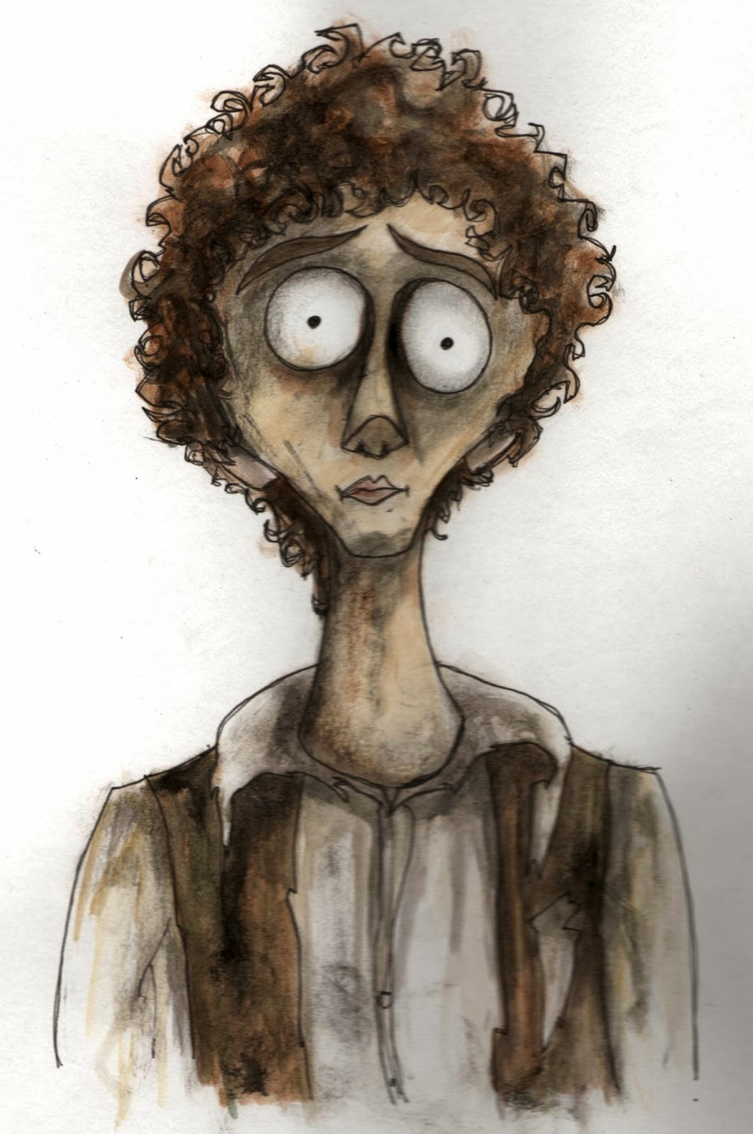
I coloured up the two best character designs and those who thought the top one looked too much like Burton retracted their statements... so glad I decided to go with it anyway. I think the bottom one has lost some of its disturbing qualities now that I've coloured it.
Monday, 10 March 2014
Perseus Character Designs
So I've been doing some character designing of the Perseus, main character variety.... I initially started off using Tim Burton as reference, such as the characters from Frankenweenie, shown below:
This is Jamie, he's the live action version of Perseus, so I tried to get some of his likeness into my designs.
After asking a few people they said my designs just looked a little too Tim Burton, that I had borrowed too much of his style and that my character resembled 'Corpse Bride's' Victor too closely. I agree with that for some of my faces, but not the one I was going with, which was the face in the bottom right of the second page of drawings down. So I drew a bit more, trying to keep a Burton feel but with less similarities, it was late at night though and I'd had enough, so didn't really get anywhere useful.
I checked out more Quay Brothers' characters, shown below, and decided to incorporate this into the character. The Quay Brothers' characters are far more uncanny and disturbing than Burton's, with more realistic faces but with squashed and misshapen features.
These last two designs are fairly disturbing in my opinion and are uncomfortable to look at, so I achieved my aim here. I personally prefer the other more 'cute-creepy' design I did, but these last two serve their purpose and genuinely look creepy, so it just depends which way the film goes, although I think the earlier design I did is better suited to the film, as there isn't any real reason for the main character, who is meant to be the hero, to look unpleasant and disturbing. Whereas it makes sense for him to look a little dark, as this aids the tone of the cell scene.
Furniture Designs For Deep
Here are some designs I drew up for the old fashioned, slightly battered and broken furniture that will line the cell. I've taken inspiration from Tim Burton to create the off kilter designs. Derek asked me to incorporate the shape of an ancient Greek lyre into the back of the chair, so this is shown in the second image. The idea is that there will be lots of little classical Greek references like this in the film, to reinforce the whole Perseus-Medusa thing that's going on in the plot.
Tuesday, 25 February 2014
Deep
Here's another drawing I did for the background design of my scene in 'Deep'. I was testing out a wooden look as this was another option we discussed in our meeting. I created this with pen and watercolour, adding colouring pencils over the top to add more texture. It's a bit messy but you get the idea. Also I'm really not too sure what I was doing when I stuck the random black pillar in the central foreground.....so yeh just pretend that bit's not there.......
Monday, 24 February 2014
Deep
One of our modules for this semester is to help out with our tutor Derek's film, 'Deep'. I chose to work on the stop motion scene, for which an animatic had already been created by previous students. I've included this below:
I'm working alongside Paris Washington, Harry Bayfield and Emily Henshall. We want to go for a style which draws upon the works of Tim Burton and the Quay Brothers. I have drawn up an initial concept piece created with black fineliner pens and then edited it in Photoshop. In our group meeting we discussed how the cell was like a make shift one that the mob boss quickly threw together in the cellar of his mansion, so it would contain an assortment of old furniture, perhaps covered by white dustsheets. I made the ceilings arched to create more of a dungeon type feel and kept my pen marks quite scribbly to get an erratic textured look.
Thursday, 20 February 2014
Stop The Privatisation Of Student Loans
So that's that, two intense weeks and this is the outcome... I think for just two weeks its pretty good to be fair. Eline Lindaas animated the swinging shackle shot for me and Vicky Keaveney animated the girl's hair, legs and arms in a cycle during the falling scene once she has been eaten by the suited guy, so serious thanks to them for helping me out in my hour of need.
Due to the time constraints I had to just get the animation to a standard where it was passable, having to then leave it and move onto the next bit. I am aware there's a lot wrong with it and it is limited animation, but I think its strong style carries it through and makes it interesting to watch. Ideally I would have created this by hand instead of on Toonboom, where I could have given the characters a lovely boiling texture by scribbling with black pen when I coloured them in, but unfortunately that never would have been finished in time. I really do long for the day when I have enough time to create something exactly the way I want it, but I feel this is growing to be a rare commodity in animation these days.
Falling And Falling And Falling And Hey Let's Do Some More Falling
These are the designs for the background when the girl and boy are falling. I had to keep panning and looping as the characters are free falling for a very long time.
When the girl gets eaten by the suited guy she falls endlessly through his insides which resemble skyscrapers. I saw this in the script and inwardly shuddered. I had no idea how I was going to create a background for that as it had to loop but with one point perspective. After some thought I drew this background below. The idea was that the girl would remain in the same place, with hair whipping etc to show she was falling, the lines indicating the walls would remain static and it would be the windows that moved. I figured if I just animated the windows enlarging on Toonboom, it would give the effect of them rushing past the girl as she fell. I would then just loop the windows getting bigger. But when I tried this it just did not work. I still think that it should work, it was just my lack of software knowledge (or Toonboom's irrational nature, whichever way you want to look at it) that prevented its success. So I had to settle for the same principle but with just one row of windows flying past at a time. I'm pretty sure the reason I couldn't do it the first way was because Toonboom has some kind of slow out motion thing going on as a default when you tween stuff, but I didn't have time to work this out as the deadline was nigh. But the fact I got it to work the second way shows that the first way would work too, just if I could figure out how to remove the slow out so everything moved at a constant speed.
Below is the design for the tower of money that shoots past the girl as she falls.
Balloon Scene
Design work for the balloon scene, where symbols showing the dreams and aspirations of the students flash in the balloons. I had to show owning a car and a house, travelling and being an artist.
A Little Bit Of Typography
This is the font I drew up, all of them look kinda different here, but in the actual animation they look a lot more similar. The reason they look slightly different is that I played around with them in Photoshop at different times and forgot what effects I used, so some of them need the background to be included to make it look right. So I've learnt to write the steps that I do down so relying on my memory isn't necessary. The font is very angular with a hint of horror about it, the edges are a bit blurry to increase the ghostly, frightening feel.
Subscribe to:
Posts (Atom)


