Saturday, 21 December 2013

11 Second Club

The 11 Second Club is an online community for animators. Every month there is a new competition where an 11 second long audio clip is released. You then have a month to create an animation that fits the audio and you can use any media, but cannot tamper with the sound at all, except by adding a few silent seconds at the beginning or end.
I'm using December's clip which has no dialogue, just sound effects. Below is my animatic.


So basically a really annoying, hyper active little kid runs in and kicks down a tower made from wooden building blocks.  He celebrates his mischievous success until he hears heavy footsteps..... and then gets his comeuppance when he is taken out by the much bigger bully type kid. I hoped that the viewer would make the link that the tower belonged to the bigger kid but I don't think it's clear enough.

I'm hoping to get a good performance out of this and really show the changing emotions of the annoying little kid. Oh and it is going to be set in a primary school classroom but I haven't shown the background in the animatic.

Thursday, 12 December 2013

Say Hello To Ernie

Another character sheet for you:


Ernie's Emotions

I found it really hard to get squash and stretch in the face, it was much harder than with Doug... so yeah this needs improvement...


Keith: A Closer Look

Woop woop another character sheet is completed! Enjoy!


Wednesday, 11 December 2013

Maggie: Attempt Number 1

Below is Vicky's version of Maggie, I took this and made it work better with the Rachel Gilbert style.


Maggie is a girl who died young in the medieval period, so although she looks like a small child she has been around in heaven for so long that she has a wealth of knowledge and acts like a worldly adult. I tried to get this attitude across in my designs and I think I achieved a certain level of intelligence in her face in my final version. I made her very pale with whitish hair (attributes of an elderly person) to add to the contrast between her technical age and the amount of time she has actually been in existence, in one form or another.


It was only once I had finished the turnaround that I realised my fatal error: I had dressed her in modern clothes!!!!! I was kicking myself for such a stupid mistake, obviously Maggie should be dressed in medieval attire, as this would give her character far more interest and be a constant reminder to the viewer that she is much more than a little girl. So expect a revised version of Maggie fairly soon. I'm going to keep her body and face the same, it will just be the clothes that change. 


Keith Turnaround


Keith Character Designs

Vicky had already designed Ernie's friend Keith, but it didn't really fit with the other characters, so I used hers as a starting point and then did my own version.
Keith is a slightly aging rocker, who like Ernie, is a pretty chilled, laid back, friendly guy. Although I liked the idea of him having a floppy hat as it emphasized the fact he wasn't too bothered about what he looked like, I felt it pushed him a little bit too much into the realms of a farmer. So I settled with a trilby type thing..


'A Dog's Life' Animatic


Hannah put together this animatic from Eline's storyboard. We all pitched in for the voice over, what joy...

The Script

Here's the script Eline wrote up for the 90 second scene we are going to animate.


Ernie Turnaround

The title says it all really...

Of Rearranging Roles And Hippy Stoner Sorts

After another crit my group came to the realisation that the way we had divided up the tasks wasn't really working, as everyone was designing characters for both films and so each character was in a different style and they were not working together. So since everyone liked my take on Rachel Gilbert's style the best I became the character designer for the 'A Dog's Life' animation. Eline is now character designer for 'Chasing Birds' and Vicky is Background designer for both projects. Hannah has taken on the role of putting the Production Bibles together and designing how they look, so she is kind of our graphic designer now.

Eline had already designed Ernie so I took her designs, which are shown below, and altered them so they fit with the over all style of the film.


Ernie is a laid back stoner character with hippyish elements, he is a bit slow and simple but with a pure heart and amicable nature. I made him look a bit more intelligent than Eline's version as although he's meant to be a bit slow he is also meant to be street smart, so I improved his posture slightly and changed his face shape and features. I painted him in quite earthy, natural colours to emphasize his relaxed, peaceful disposition and his hippy tendencies.


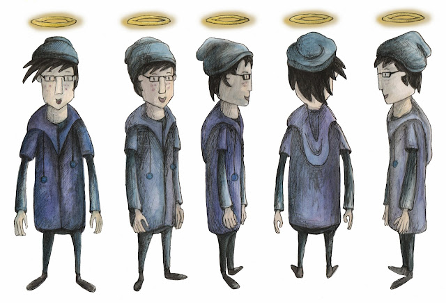
Jonny And Joe Turnarounds

Below you will find the turnarounds for the two frisbee throwers, Jonny and Joe, as well as their respective action shot sheets.


Frisbee Throwers

We have to animate a 60 to 90 second segment of our film after the Christmas holidays, so obviously this is a very small fraction of our feature film, so we needed to choose a good scene that could work on its own somewhat, while giving a flavour of the themes of the film. The scene we chose is where Ernie is showing around the disguised Doug in Human Heaven for the first time. He leads him through an attractive looking, busy green city, full of fountains and plants. The streets are full of people relaxing and socializing. Two of Ernie's friends call out to him and he introduces Doug to them. But Doug spots two people playing frisbee in a park and is suddenly overwhelmed by his natural dog instincts and struggles to control his urge to chase the frisbee. He cannot fight it and runs off on four legs, with his trench coat flapping out behind him, hat flying off his head, while Ernie looks on in dismay.

I was tasked with designing the two frisbee throwers. I initially was going to make them young adults but after an unsuccessful drawing session I went away and decided they would work better as little kids. I then came up with two characters I was happy with, applying slight asymmetry to their clothes and hair to give them charm. Rachel Gilbert doesn't really have any examples of people in her work, focusing instead on animals, so I had to base my kids on her animal characters, trying to keep the same shape structure, which I believe I have achieved to some extent. The textures and colours of the characters fit with her style and match with my design of Doug. 


Action Shots!!

Here is Doug doing Doug like things :)


Doug Turnaround

I have never done a turnaround before so this was fairly interesting....
It took me a few attempts to get it right but I think I got there eventually. The front and back views were really easy but the side views proved a challenge, especially because Rachel Gilbert's style is quite flat and not really intended for use in a 3D world, so although the character may work in a front view, it doesn't necessarily work from the side.


Finally, Some Colour


And here we have the final watercoloured versions of Doug in his three main states that he will appear in in the film. I tried to maintain the textured look of Rachel Gilbert with my application of the paint, as well as drawing from her colour palette. I also added some black fineliner shading, just to give the characters a bit more definition. I am quite happy with these designs as I feel they reflect Rachel Gilbert but also give a sense of the personality of Doug. 

More 'Doug On All Fours' Versions

Just a short post to show more developed versions of Doug in his natural quadruped state. I changed my mind and decided he works better with a slightly realistic set of hind legs.


Tuesday, 10 December 2013

The Many Faces Of Doug

The first image shows my first attempt at creating facial expressions for Doug at the same time as playing about with certain aspects of the design of his face. The circled head is the shape I settled on in the end. After my crit with my tutors they suggested that I give Doug more charm by creating some asymmetry in his face, as characters who are not perfect are far more relatable, as they appear more human. So the second image shows my experiments with adding charm, I used patches, freckles, lopsided ears etc to achieve this. My final version combined patches around the eyes and lopsided ears. I think Doug definitely looks better like this, he looks like he has more depth and personality to him, so I need to remember asymmetry is the way forward when designing characters.
I also started to play around with how Doug would look on all fours, but when I gave him more realistic hind legs it strayed to far from Rachel Gilbert's style, so I feel straight legs worked better. I also had to make sure the proportions matched his standing proportions, as it had to look like they were the same character. 


In this last page I was experimenting with applying more stretch and squash to the face to achieve different emotions, as my tutors made the point that in my previous expressions the head remained the same except for the mouth shape and eyebrows changing. I found it quite difficult to manipulate the head shape without making the dog look like a different character all together. I could still probably push these further but I do feel they look more emotive than my more static, previous designs.


Step 1. Dress As A Human

The first step to infiltrating Human Heaven is to dress like a human. Here are various options for how Doug should look when he is in disguise as a human. We decided he should wear a trench coat to maintain his air of sophistication and superiority, but also as it is would cover up most of his body, helping to make him look suspicious. Again, the hat, shirt and trousers add to the sophistication. 


Doug Character Designs

My group decided they liked my designs for Doug the best so everyone would try and create the other characters needed for 'A Dog's Afterlife' in the same style. Below you can see my development until I reached a design I was happy with. I was aiming for a slightly arrogant, cocky look, as Doug believes he knows everything and is always right. But he also needed to be friendly and relatable, as well as having an air of intelligence about him. His body is quite agile and athletic, yet retains that simple boxy look of Rachel Gilbert, with skinny, tapering arms and legs. I included a collar as I felt it reinforced his loyal nature and it would be a constant reminder that he wanted to find his owner.


The Style Card...

My style card for the 'A Dog's Afterlife' film was a Falmouth Illustration Student, so my group had a lot of free reign on this in comparison to the style for 'Chasing Birds'. We took a look at past Illustration students blogs and websites and came to the conclusion that Rachel Gilbert's style was best suited to our story.


Above is my attempt at reproducing some of Rachel Gilbert's work. Her style uses simplified forms, soft watercolours and rough textured brush strokes. The limbs of her characters are very skinny and tend to taper towards the end, whereas the torsos are quite boxy.

Below are some images of her work, as you can see, she does incorporate more detailed line work into her illustrations, such as the 'One Who Flew Over The Cuckoo's Nest' book cover.